Designing Zoom's first in-meeting apps, starting with Timer
- Company
- Zoom makes video meetings, phone, webinars and more. Zoom Apps let people use apps inside a meeting, in a panel beside the video.
- Team
- Me (product designer) on Zoom's Apps team, working directly with a product manager and an engineering team
- My role
- Design of Zoom's first-party in-meeting apps, and UX review of third-party apps
- Timeline
- 2021 – 2023, my first two years at Zoom
- Challenge
- The apps platform was new. Zoom's own apps had to show what a good in-meeting app looks like, before many others existed.
The problem
In 2021 Zoom opened meetings to apps. An app lives in a narrow panel next to the video, and it runs for everyone in the call at once. That’s a different job from a phone or desktop app with a single user.
Zoom needed its own apps first, to give people a reason to open the panel and to show developers what good looked like. A timer sounds like the simplest app there is. In a meeting it isn’t: one person starts it, but everyone has to see it, trust it and not be able to break it.
How might we make an in-meeting app feel like part of the meeting, for everyone in it, and not just a tool for the person who opened it?
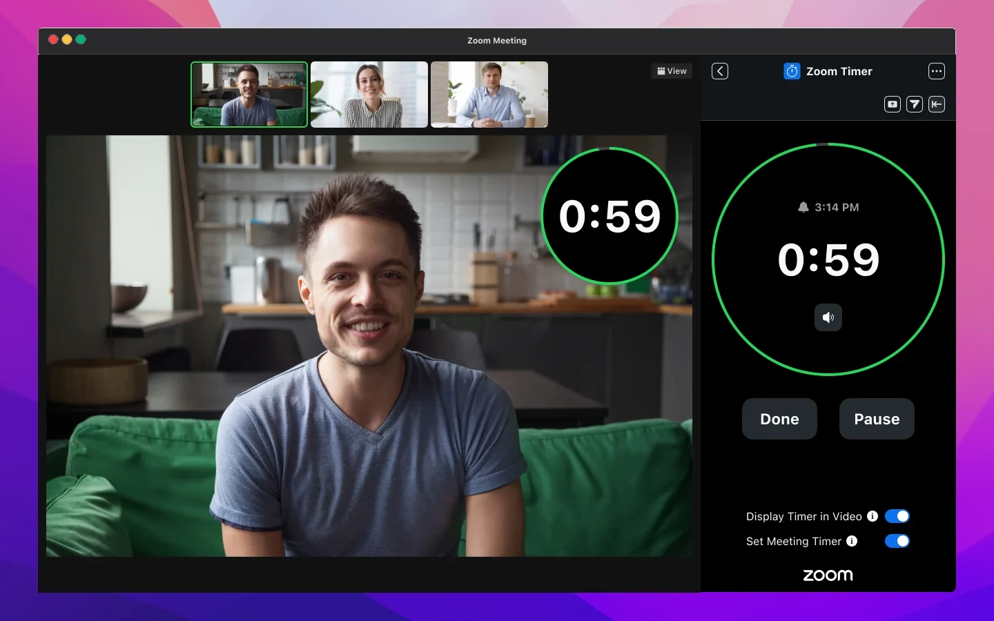
Put the time where people already look
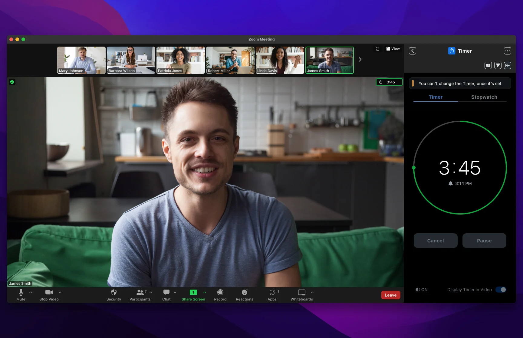
The first Timer showed time in a small badge in the meeting's corner. V3 moved it onto the video itself.
What we gave up: a clean video. The timer covers part of the speaker's frame, so it's a toggle, and the panel says to keep Mirror my video off.
In the first version, the timer joined Zoom’s built-in meeting timer as a small badge at the top right, and a chat message told everyone it had started. People were looking at faces, not the corner of the window.
In V3, “Display Timer in Video” draws a large countdown ring on the speaker’s video, so it shows up in gallery view and speaker view. The panel keeps the controls.
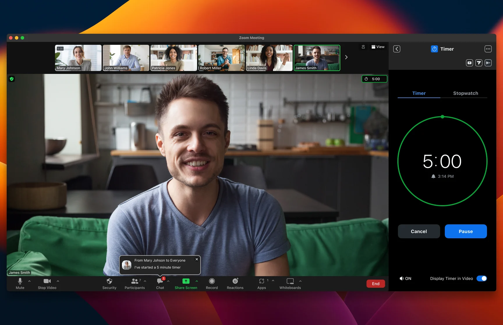
Make starting a timer one tap
V3 cut the setup down to quick-start presets under the time picker.
Most meeting timers are the same handful of lengths: a five-minute break, a ten-minute exercise. V3 puts 5, 10, 15 and 20 minutes one tap away, with hours, minutes and seconds above for anything else. Two toggles at the bottom decide where the time shows.
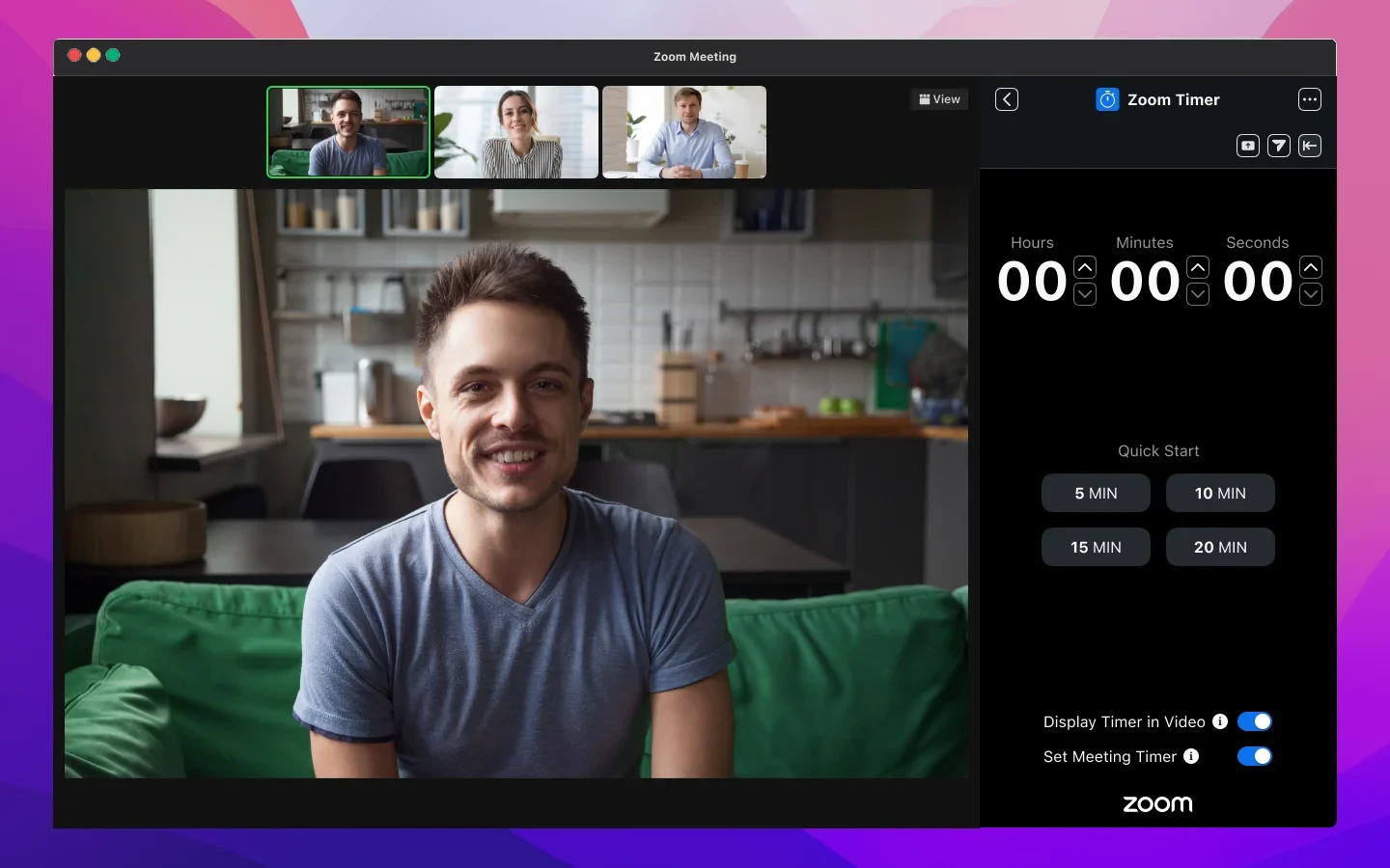
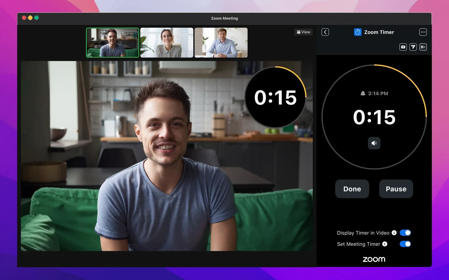
Design for the people who didn't start it
I mapped Timer for hosts and guests, in speaker, gallery and screen-share views, before drawing the final screens.
What we gave up: some flexibility. Once a timer is set, guests can't change it.
A timer someone else can reset isn’t a timer. The spec covered who starts it, who can edit it and what everyone else sees. Guests get the countdown with the controls turned off and a short note saying why.
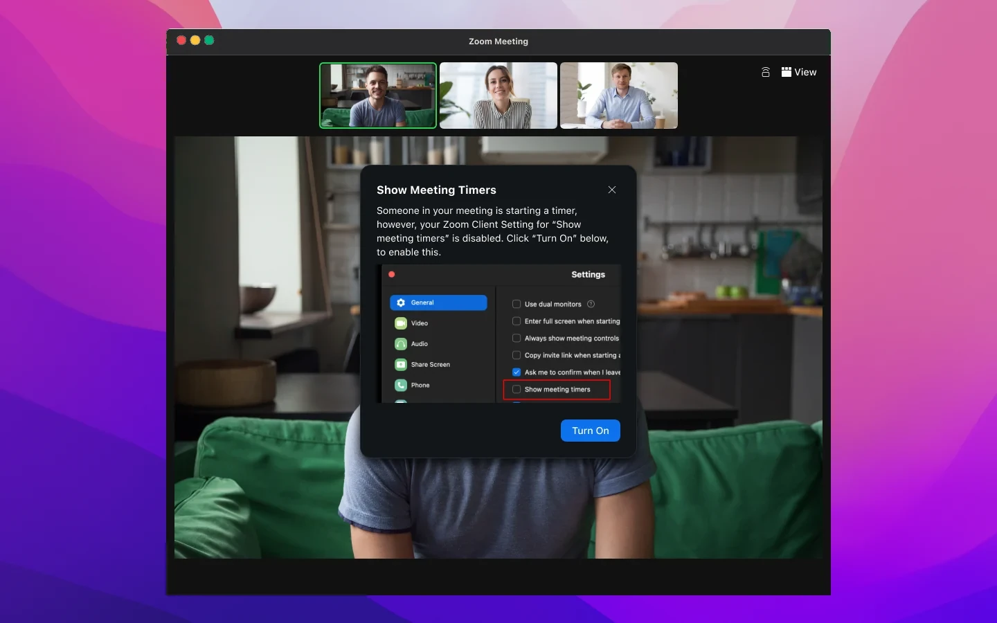
It also had to work around Zoom’s own settings. If someone had “Show meeting timers” turned off, the app explained what was happening and offered one button to turn it on, instead of failing silently.
Name music by what the meeting is doing
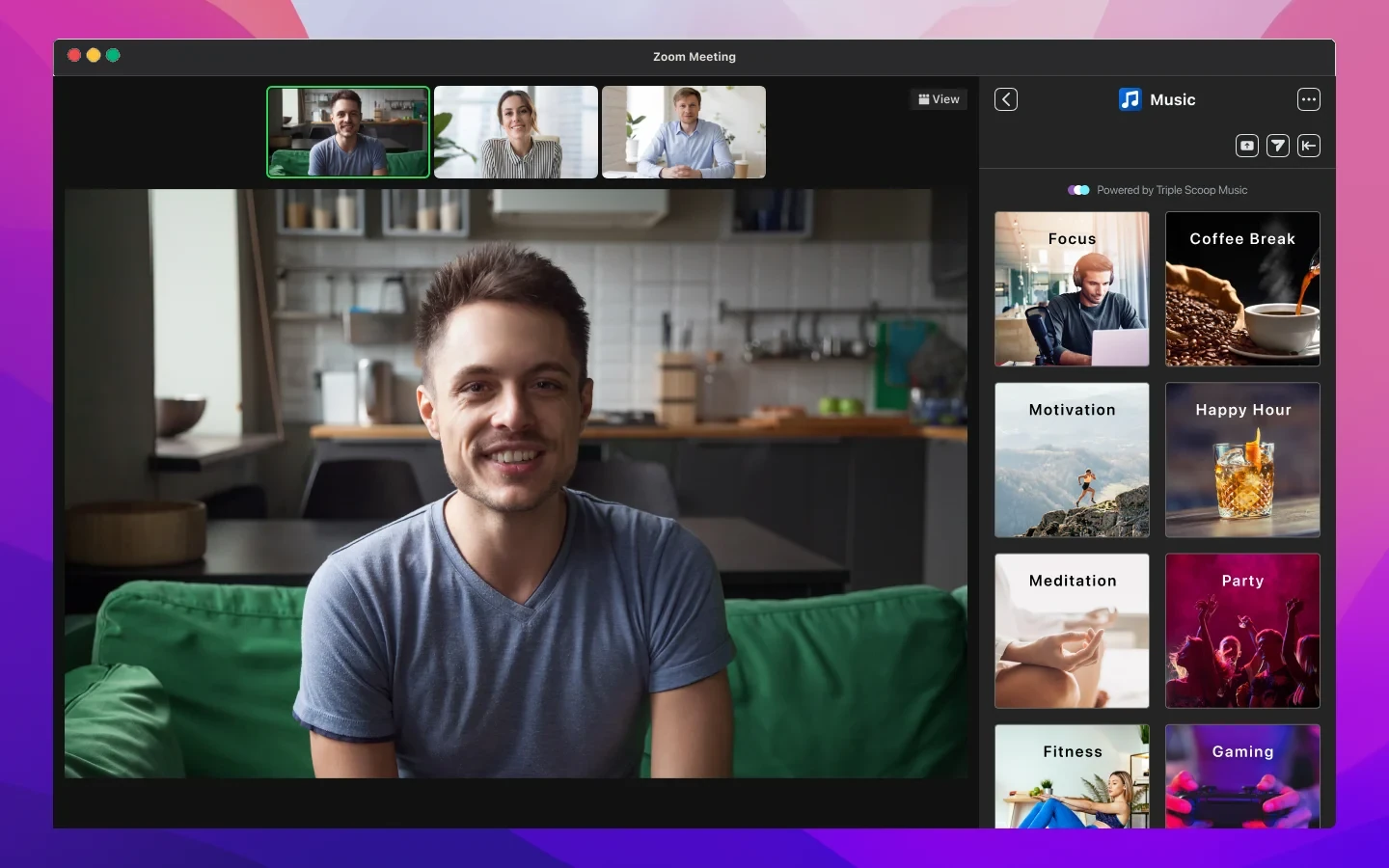
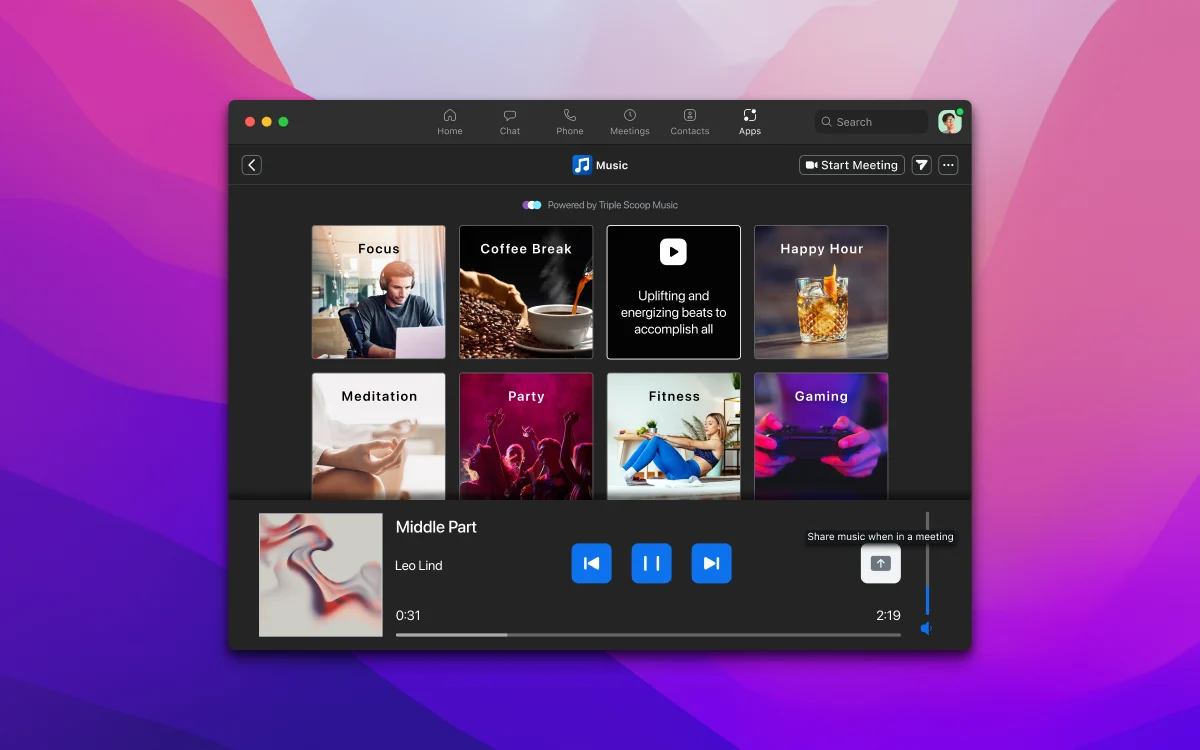
Early Music designs sorted stations by genre. The final one sorts them by moment: Focus, Coffee Break, Happy Hour.
Nobody in a meeting thinks “I’d like some indie.” They think “we’re taking a break” or “heads down for ten minutes.” The early files list genres like Pop, Hip-Hop and Country, with an explicit-content setting. The final design replaced them with stations named for the moment, from a licensed library, and only one person can share music at a time.
Reviewing other people’s apps
Alongside Zoom’s own apps, I reviewed third-party apps against Zoom’s UX guidelines before they reached the App Marketplace. Designing Timer and Music first meant I’d already hit the problems those developers would hit, like a narrow panel, many viewers and settings that can hide your app.
What I’d do next
Measure it. I’d want to know how often a timer is started by someone other than the host, and whether the in-video timer gets turned off. Those two numbers would tell us whether the V3 decisions held up.
- Reviewed third-party apps against Zoom's UX guidelines before they reached the App Marketplace.
- Mapped every state of Timer by role and meeting view so engineering could build it without guessing.
- A timer that reads at a glance on someone's video, with a color change before time runs out.
- Permission and settings conflicts handled in the moment, with one clear fix.
- Music stations named by what the meeting is doing, not by genre.