Redesigning Counter's seller back office, tested four times before launch
- Company
- Counter is a clean-beauty brand. When I was there, it sold through a large network of independent consultants.
- Team
- Me (UX design and research), a brand and visual designer, a research partner, product and engineering
- My role
- Designed the test prototypes and led all usability testing, end to end
- Timeline
- Nov 2018 – Mar 2020
- Challenge
- Consultants ran their business in an old back office that made daily tasks slow.
The problem
Counter’s consultants are independent sellers. Behind the Counter is where they order, track their earnings, run their events and look after their clients. For many, it’s the tool they use every day.
The old version buried the things that make a consultant money. Finding your best customers or following up with a client meant digging through pages of tables. Counter was rebuilding it, and I was the company’s only UX resource.
How might we give consultants back the time they spend fighting their own tools?
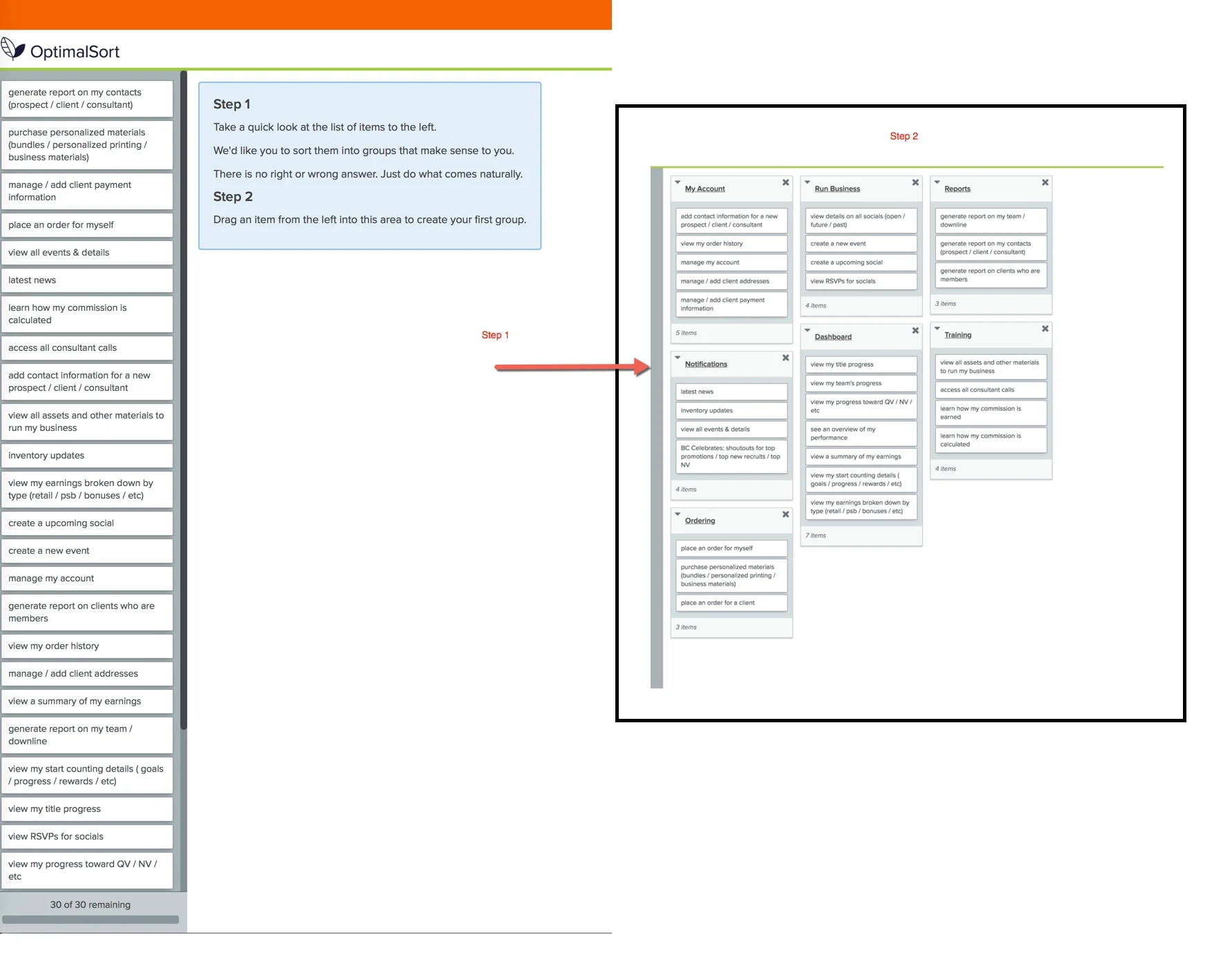
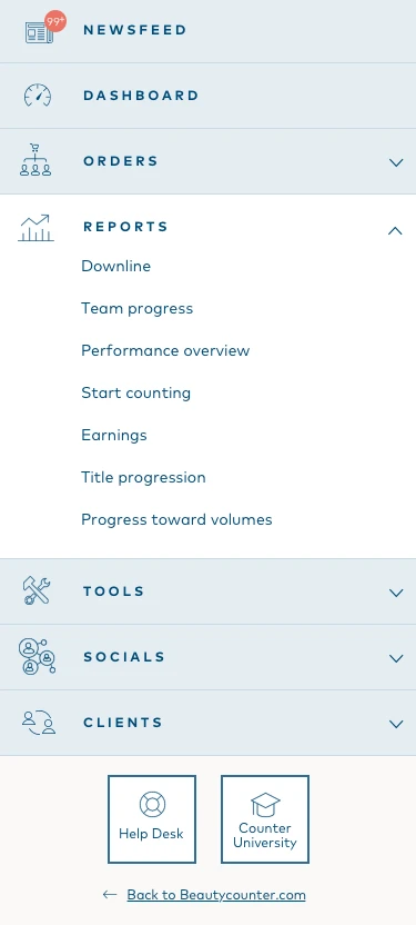
Before any screens, a card sort with 15 consultants mapped how they group their work: Dashboard, Socials, Clients, Orders, Tools and Account. That became the new navigation.
Test early, with the right people, four times
I ran four rounds of prototype testing in five months, and changed the design after each one.
- Round 1 (Nov 2018): 8 people worked through 5 modules and 72 tasks, unmoderated. Task success was 97%, with two critical problems: nobody could tell what the volume metrics meant, and notification settings were hard to find.
- Round 2 (Dec 2018): we moderated sessions with real consultants, both team leaders and beginners. 87.5% of ratings were strong.
- Round 3 (Feb 2019): we tested 8 modules, and only 5 of 48 ratings were weak.
- Round 4 (Mar 2019): all four groups tested every module on desktop and mobile. 91.7% of ratings were strong.
Leaders and beginners use the back office in very different ways. Testing both, every round, kept the design from serving only the loudest users.
Explain the numbers where people read them
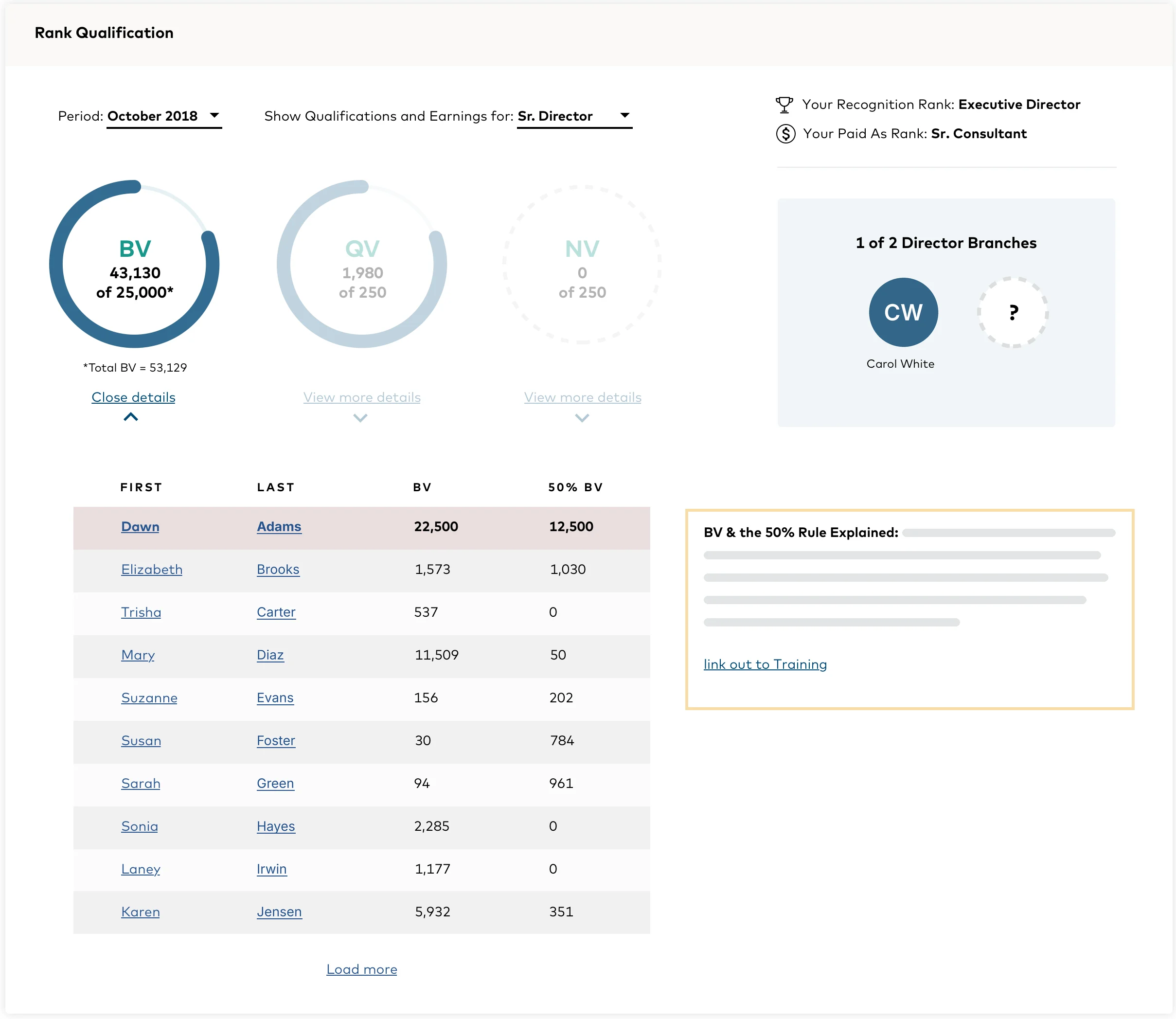
We added a tooltip to every volume metric, right where it appears.
Consultants are paid on metrics with three-letter names. Round 1 showed that even experienced sellers weren’t sure what each one meant. Instead of a help page, we explained each metric in place.
We also moved search above the data tables and relabeled sections in consultants’ own words.
Put top customers one tap away
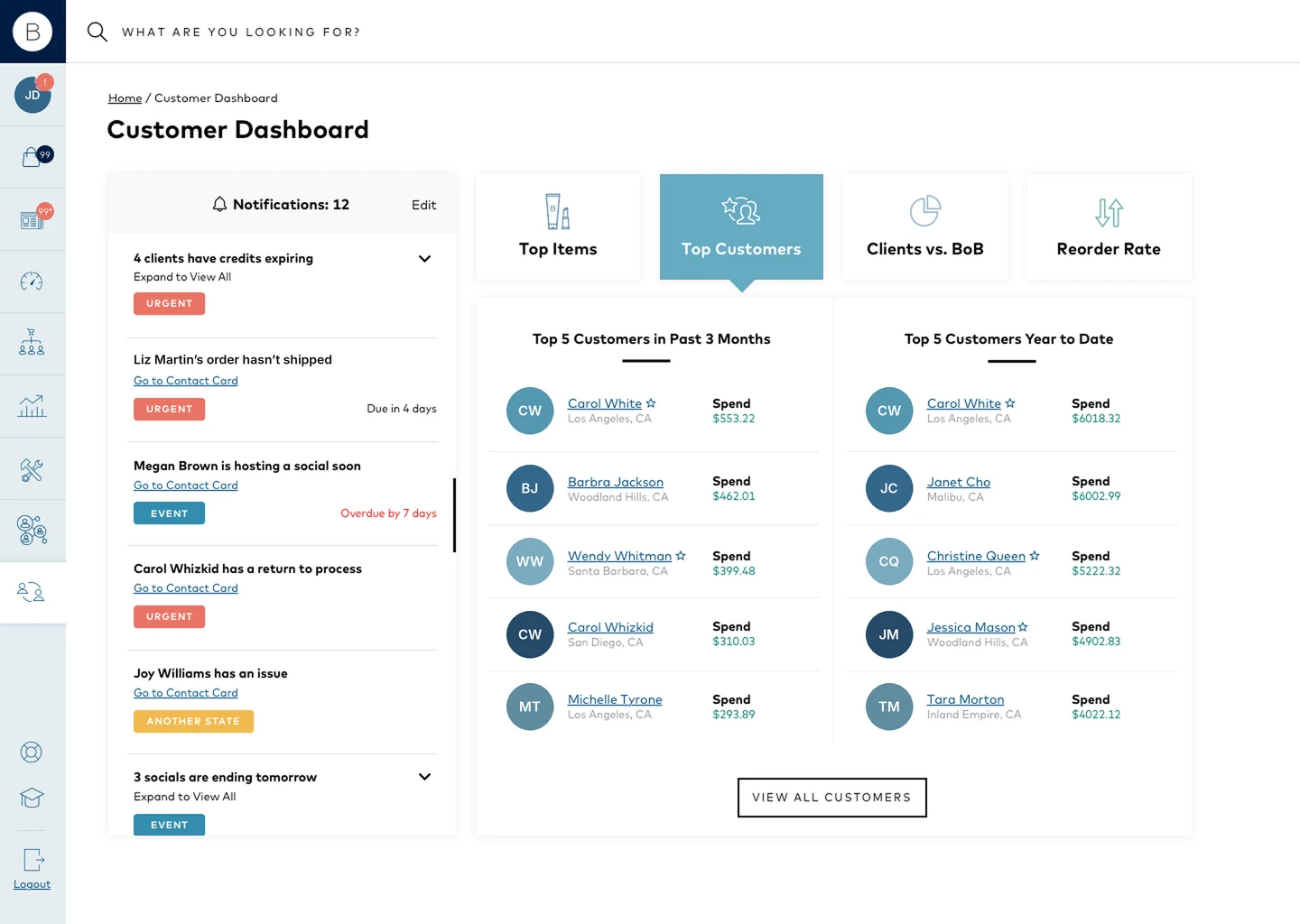
We added a dedicated Top Customers view, instead of a report to dig through.
During alpha testing, one director told us: “I found out that I didn’t personally know seven of my top customers.”
Your best customers are your business. The new back office put them on their own tab, ready for a thank-you note.
The final experience
Quick Order launched in April 2019, and the redesign rolled out from June. In February 2020 I reworked notifications, the home screen and notes, using FullStory heatmaps and beta feedback. The new back office was fully live by the end of March 2020.
Results
In February 2020 I ran a before/after test. Eight consultants did the same nine real tasks on the old back office and on the new one.
- The new version saved 1.0 to 3.3 minutes per task on average, depending on the scenario.
- The biggest gain was thanking a top customer: about 6 minutes on the old site, under 2 on the new one.
- On the old site, several people couldn’t finish the client follow-up tasks at all.
One consultant summed it up: “The time spent running my business is going to be cut in half.”
The sample was small and a few sessions weren’t usable, so I treat these as strong signals, not precise measurements.
What I’d do next
Measure time saved in the live product, not just in a test, and track whether consultants who use Top Customers sell more.
- Owned usability testing for the company's number-one priority project, as its only UX resource.
- Planned and ran four testing rounds, and turned each into specific fixes for product and engineering.
- Took the program from card sort to a measured before/after test of the shipped product.
- Hi-fi desktop and mobile prototypes for every tested module.
- Research methods matched to the question: card sort, unmoderated and moderated testing, before/after timing.