Rebuilding how people buy and pay for Zoom
- Company
- Zoom sells meetings, phone, webinars and more online, to individuals, small teams and large businesses.
- Team
- Me (product designer) on Zoom's Growth & Monetization team, with PMs, engineering, Billing operations, Legal and content design
- My role
- Helped design web checkout as part of the team, and designed the billing portal
- Timeline
- 2023 – 2025
- Challenge
- Buyers had to get through a four-step legacy wizard, and billing pages confused the people paying the bills.
The problem
Zoom’s web checkout is where self-serve growth turns into revenue. The legacy version was a four-step wizard. Every buyer saw the same steps, whether they were one person upgrading to Pro or a business buying many licenses with Phone and Webinars.
After the purchase, the billing portal had the opposite problem. It had to show 34 product variants and 17 custom use cases across 3 breakpoints. The people who heard every complaint about it were Zoom’s own billing agents and account executives.
How might we make buying Zoom feel like one short decision, and paying for it feel like no surprise?
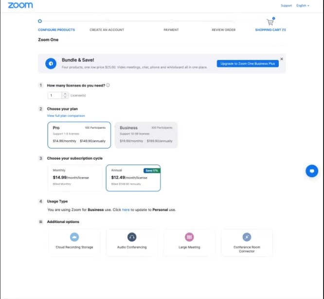
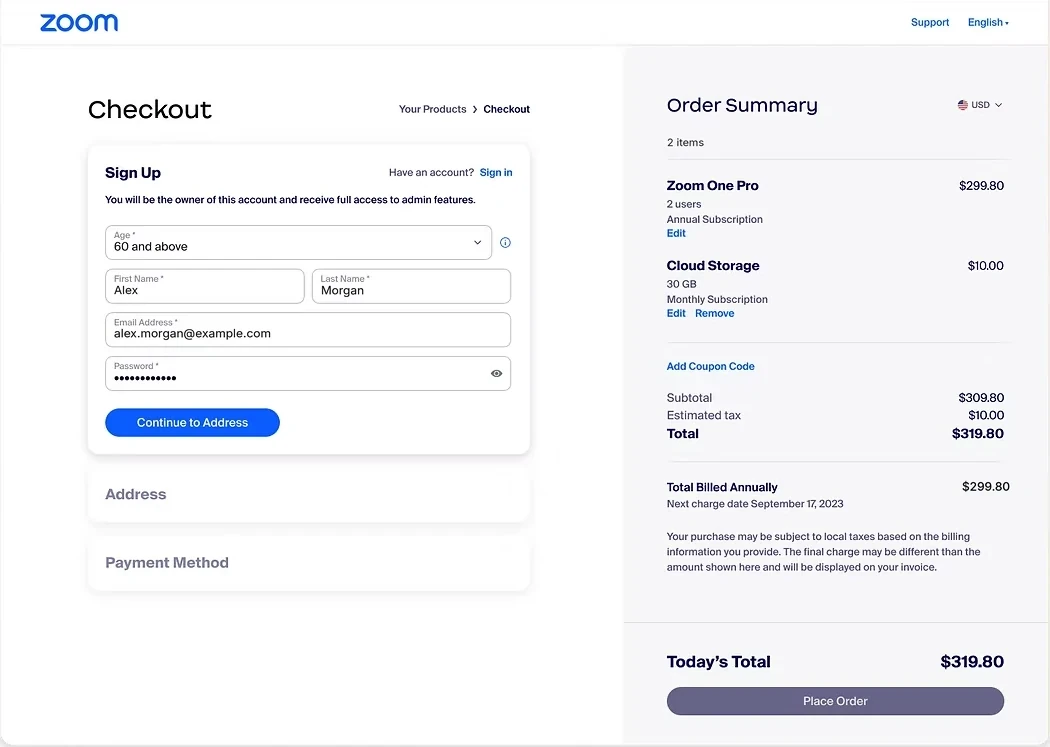
One page instead of four steps
We replaced the wizard with product setup, sign-up and a single-page checkout with a live summary.
What we gave up: a guided, one-thing-at-a-time feel. The steps stay visible as sections, so the page still reads in order.
The wizard hid the total until the end and made every change a trip backward. On one page, the order summary sits next to the form and updates as you go. You always know what you’re paying and why.
Tailor the flow to who's buying
Checkout changes by buyer type, instead of one flow for everyone.
A first-time buyer, a free user upgrading and a current customer adding a product need different things. We showed each one only the fields and choices that applied, and routed larger accounts toward sales where self-serve wasn’t the right fit.
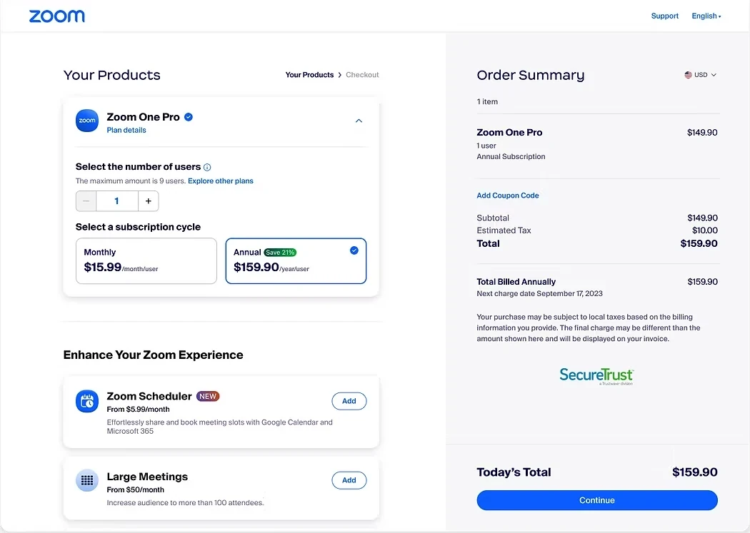
Upsell only at moments of intent
Add-ons appear next to the choice they relate to, not as a wall before you pay.
The old flow pushed extra products at people who hadn’t finished choosing their main plan. We moved upsells next to the choices they relate to, so they read as help instead of friction.
Design billing for the people who explain it
We surveyed 32 billing agents and account executives before drawing anything.
Customers rarely tell you why a bill confused them. The agents who answer their calls know. Eight billing agents and twenty-four account executives told us where people got stuck, and a content audit showed where the portal’s language didn’t match the invoice.
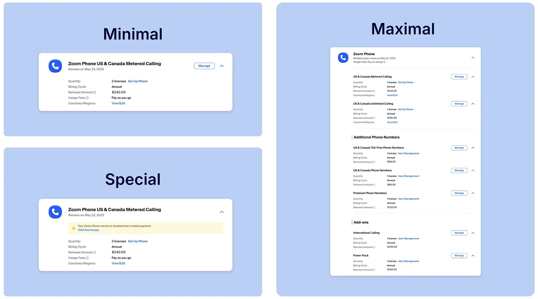
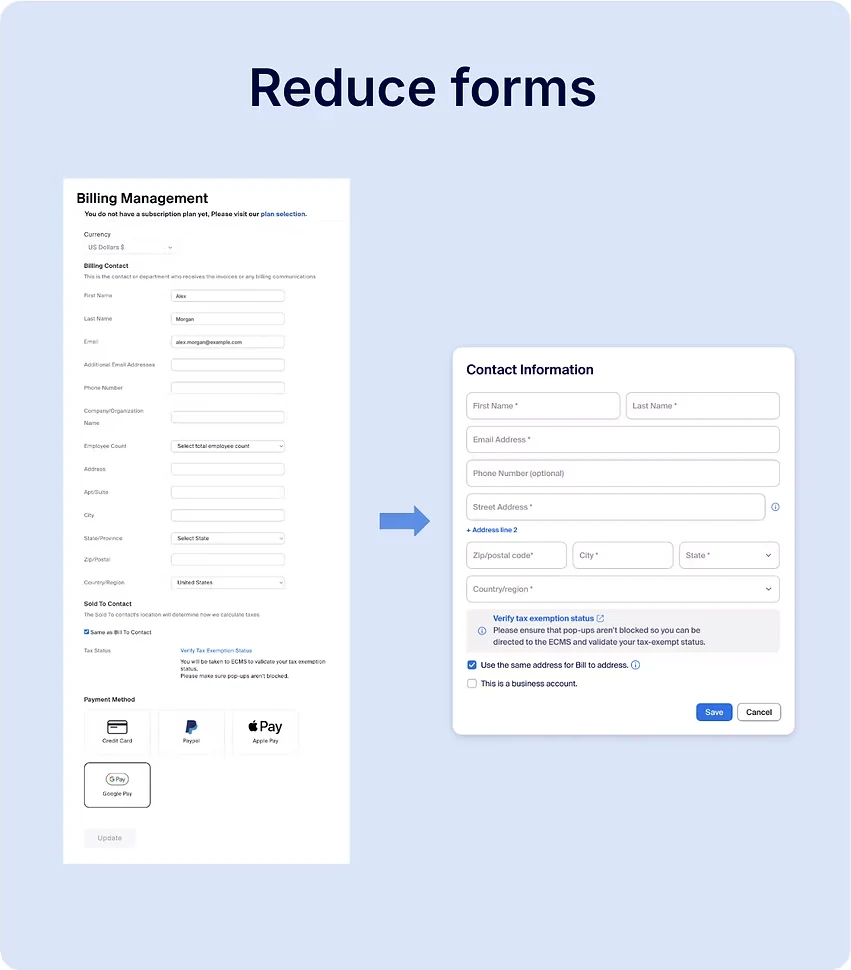
That research shaped three card states (minimal, special and maximal) that let one layout hold any of the 34 variants. It also led us to cut forms wherever we could.
Small words mattered too. Across eleven reviewed versions of Payment History, “Unable to Process Payment” became “Your payment method was declined”, and then “Payment Update Required”, which tells you what to do next.
Results
Buying Zoom online went from four steps to one page tailored to each buyer, and billing was rebuilt around what agents told us customers struggled with.
I didn’t own the measurement on these launches, so I share the decisions here rather than numbers.
What I’d do next
Test the order of the page itself, plan choice first versus account creation first, by buyer type. And bring the billing portal’s “what to do next” language into checkout’s error states.
- Set up the design kickoff and handoff process for growth work across web and native, which other designers used.
- Brought Billing operations, sales and Legal into the design process early, through surveys and reviews.
- A three-state card system that holds 34 product variants in one layout.
- Responsive checkout and billing at three breakpoints.
- Checkout and billing copy written with content design, down to the wording of payment errors.